| クライアント | 株式会社 MOM’S TOUCH TOKYO |
|---|---|
| 展開サイズ | 1080×1080、1080×1350、1080×1920など |
| 掲載先URL |
|
| 制作期間 | 2025年3月から |
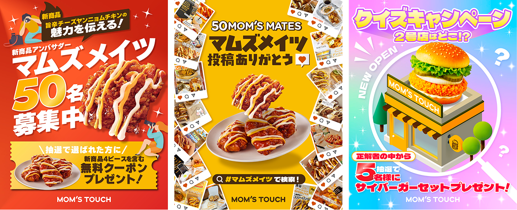
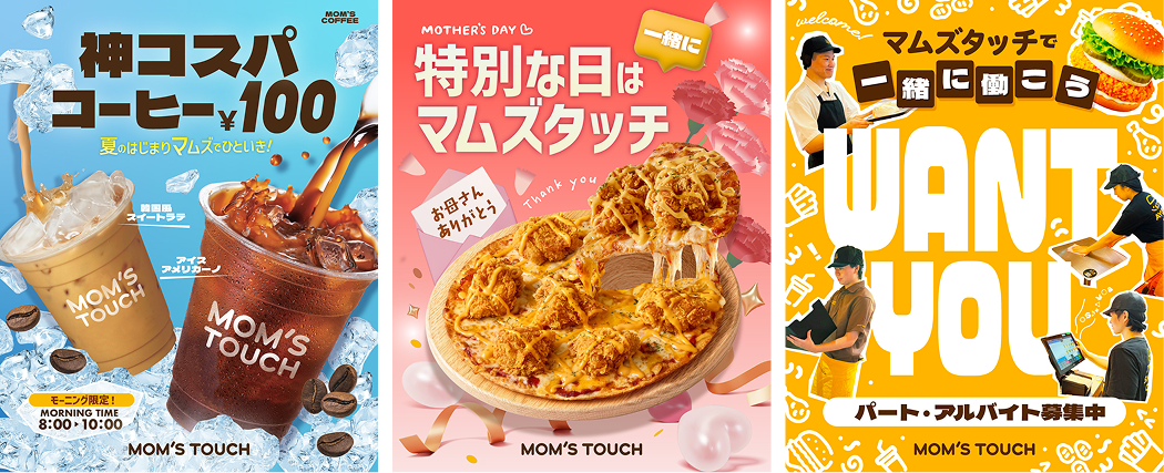
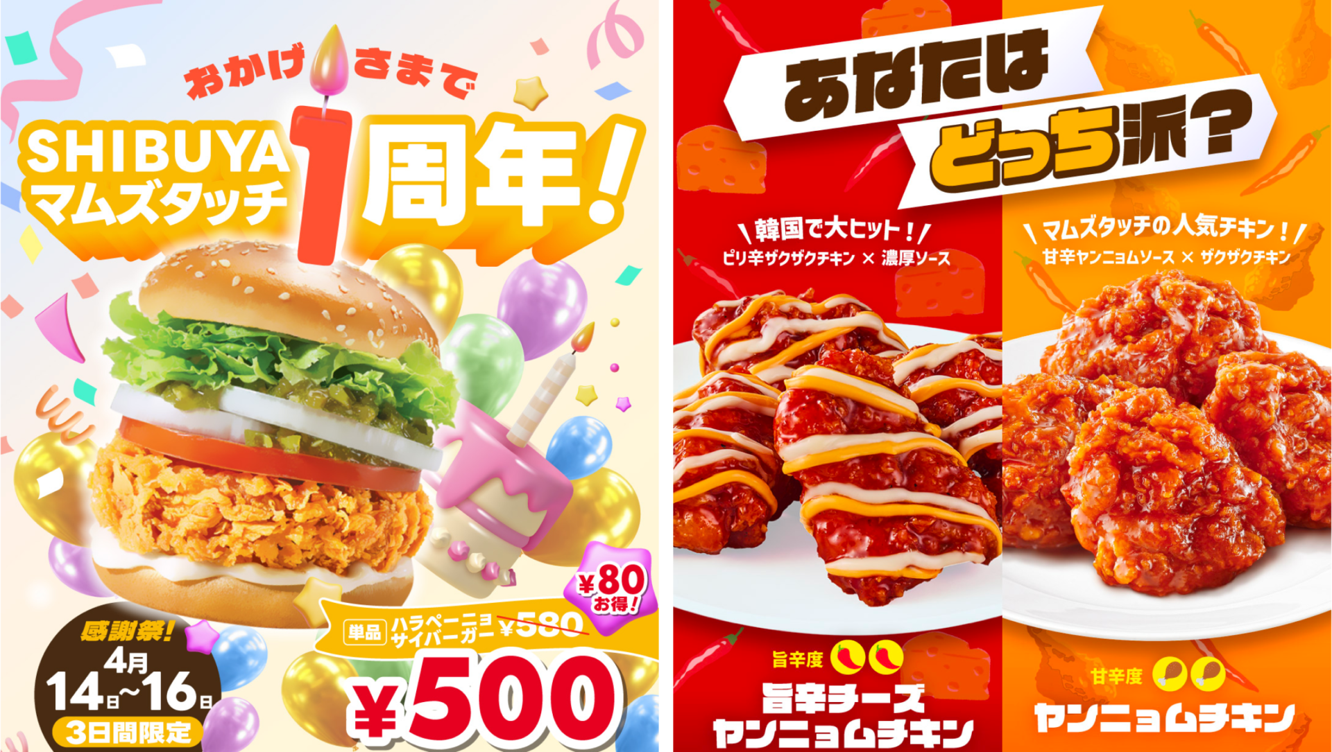
| デザイナーからのコメント | 商品のシズル感を活かしながら、SNSで映える遊び心・可愛らしさをバランスよく取り入れるよう心がけました。 ブランドトーンを大切にし、テキストの装飾は最小限に抑えつつ、文字組で印象を引き立てるレイアウトを意識しています。 |
| English Translation | Client
Deliverables
Live Link
Project Duration
Designer’s Perspectives |
| 한국어 번역 | 클라이언트
매체 구성
게시처 URL
제작 기간
디자이너 코멘트 |