| クライアント | 株式会社 MOM’S TOUCH TOKYO |
|---|---|
| 展開サイズ | A1、サイネージ用(1920×1080)など |
| 制作期間 | 約3週間 |
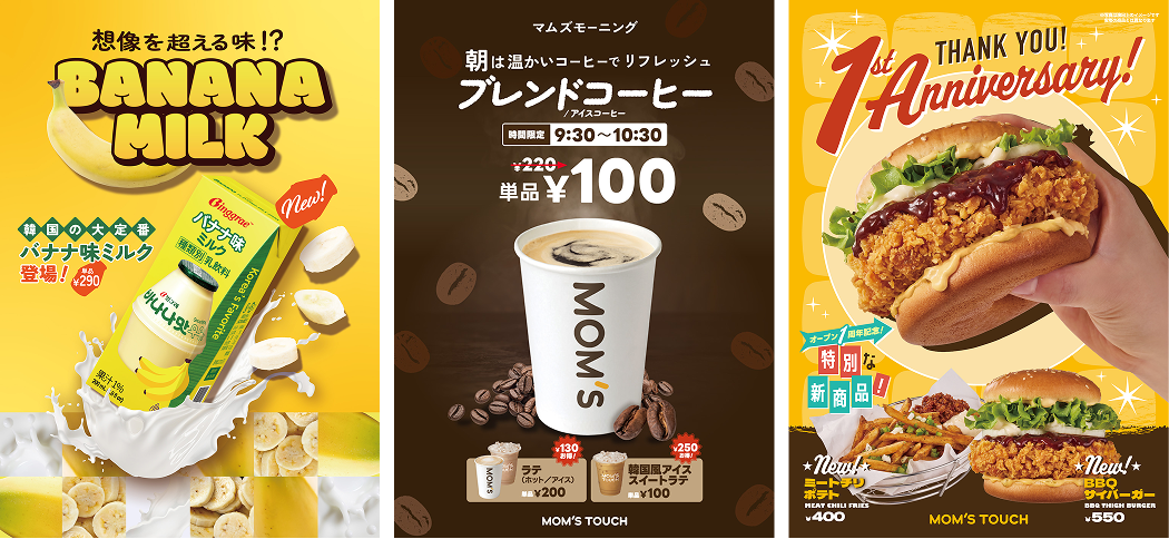
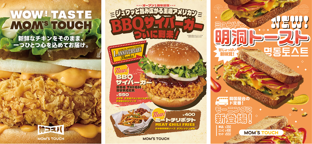
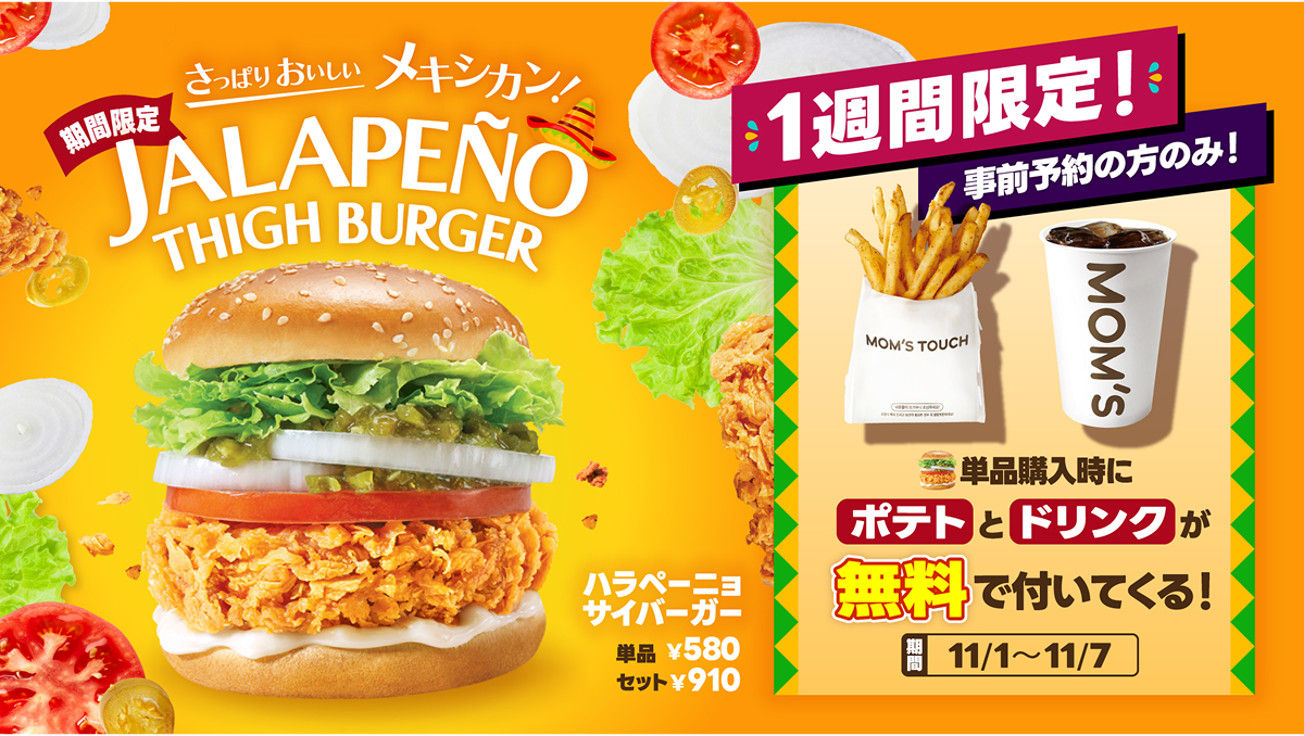
| デザイナーからのコメント | 見た瞬間においしさが伝わるよう、シズル感を大切にデザインしています。商品名もロゴのように丁寧に作り込み、1枚のポスターで味わいや素材のストーリーまで感じられる表現を目指しています。 |
| English Translation | Client
Deliverables
Project Duration
Designer’s Perspectives |
| 한국어 번역 | 클라이언트 주식회사 MOM’S TOUCH TOKYO
매체 구성 A1 포스터, 사이니지용(1920×1080) 등
제작 기간 약 3주
디자이너 코멘트 보는 순간 맛이 느껴질 수 있도록 ‘시즐감(Sizzle)’을 살리는 데 중점을 두어 디자인했습니다. 상품명 또한 로고처럼 정교하게 제작하여, 포스터 한 장만으로도 맛의 깊이와 식재료의 스토리까지 경험할 수 있는 표현을 지향하고 있습니다. |